 Skip to content
REDESIGNED KITCHEN RENOVATION · SPRUCE GROVE
A Kitchen Designed
The Way It Should Be.
An average-sized kitchen that works better, looks cleaner, and earns its place through planning rather than square footage.
SPRUCE GROVE AB
These homeowners had renovated before. More than once. They arrived at this project with a clear sense of what good looks like, and a clear sense of what the existing kitchen was not delivering.
The kitchen had been renovated by a previous owner. The finishes were newer, but the thinking behind them was not sound. The layout was only partially functional. The island was the wrong size for the room. Storage looked adequate on the surface and fell short in practice. It was a kitchen that had been made to look renovated without being properly planned.
That distinction mattered to these clients. They were not looking for a kitchen that simply looked new.
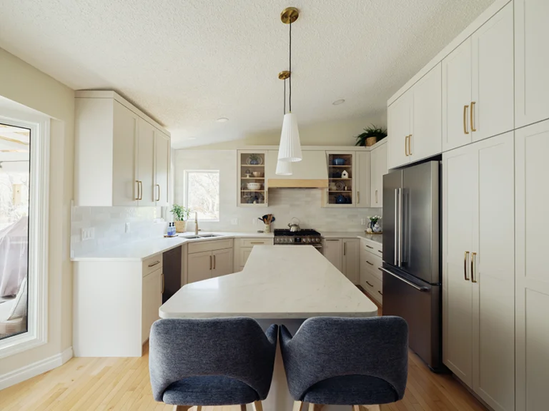
The Wrong Island in the Wrong Room
This is not a large kitchen. It is an average-sized kitchen that needed better decisions, not more room.
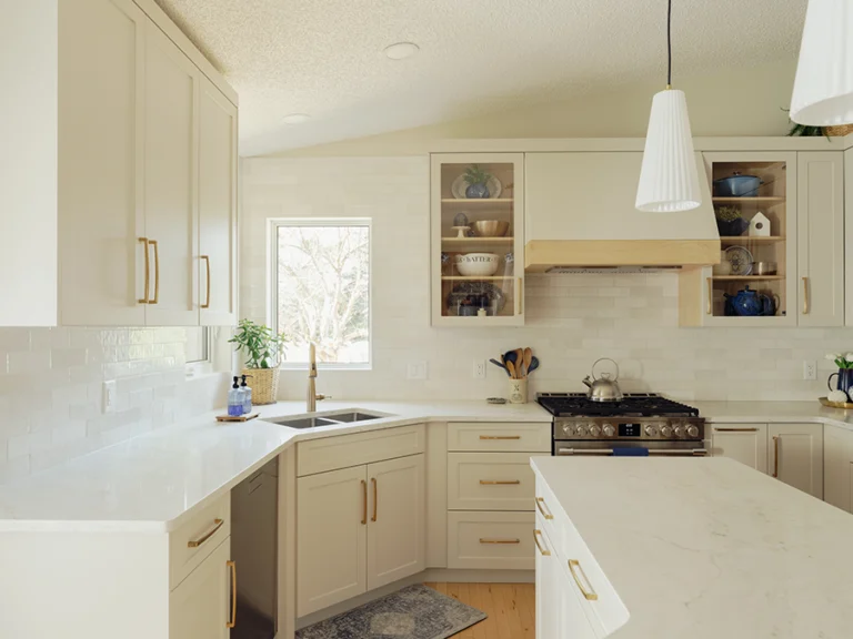
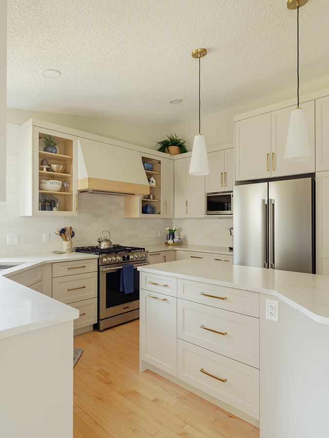
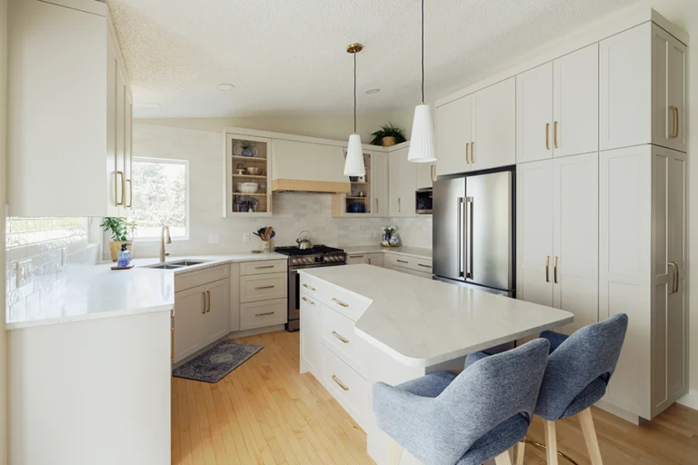
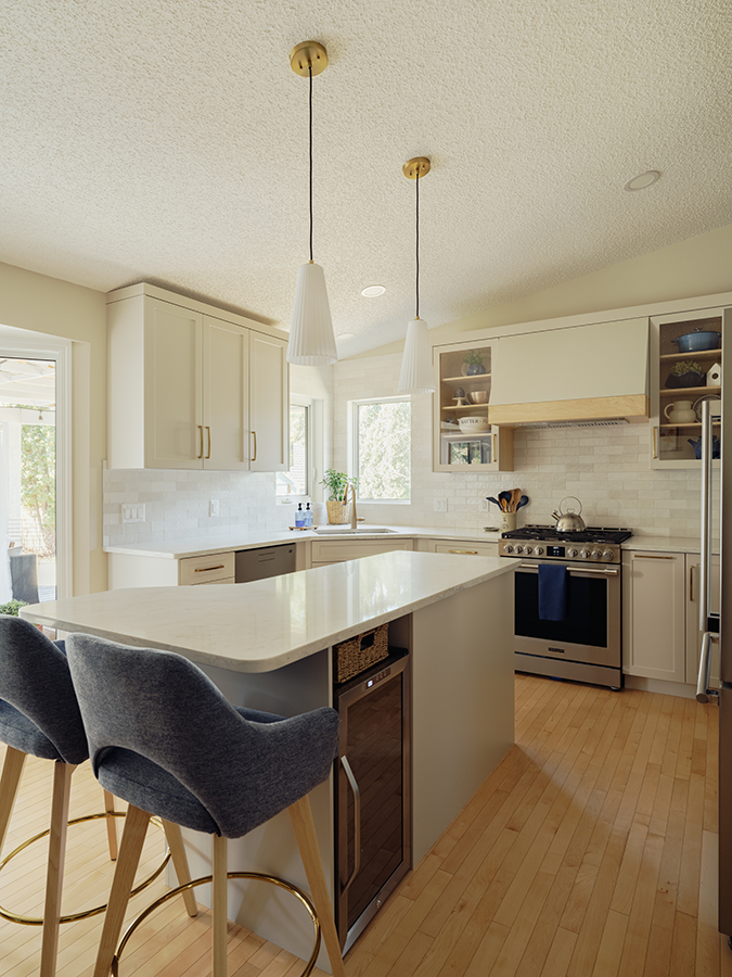
The island was the key decision. A standard island shape dropped into this space would have created the same problem the old one had: something that occupied the room without serving it. Instead, the island was designed around the kitchen itself. The shape, the proportion, and the placement were all worked out relative to how the room moves and how the homeowners use it. The result is an island that improves prep space, storage, and flow simultaneously, and that looks like it belongs rather than like it was placed and left.
The Island
APPROACH
Designed the island around the specific dimensions and movement patterns of the room
CHALLENGE
Standard island proportions were occupying space without serving it
SOLUTION
Custom shape, proportion, and placement worked out relative to actual kitchen use
RESULT
Island that improves prep space, storage, and flow simultaneously
What You Do Not See Right Away
The biggest functional wins in this kitchen are behind closed doors.
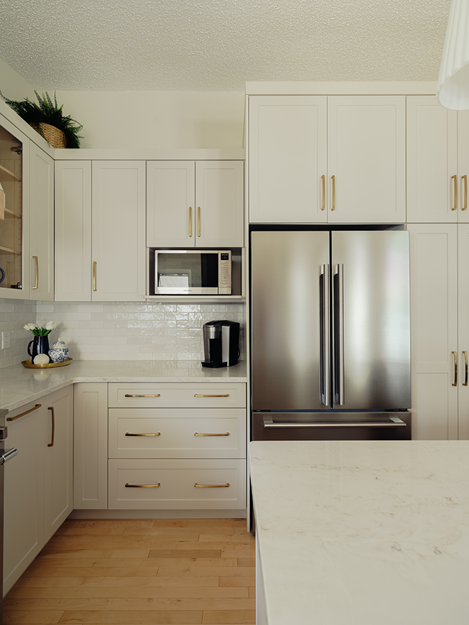
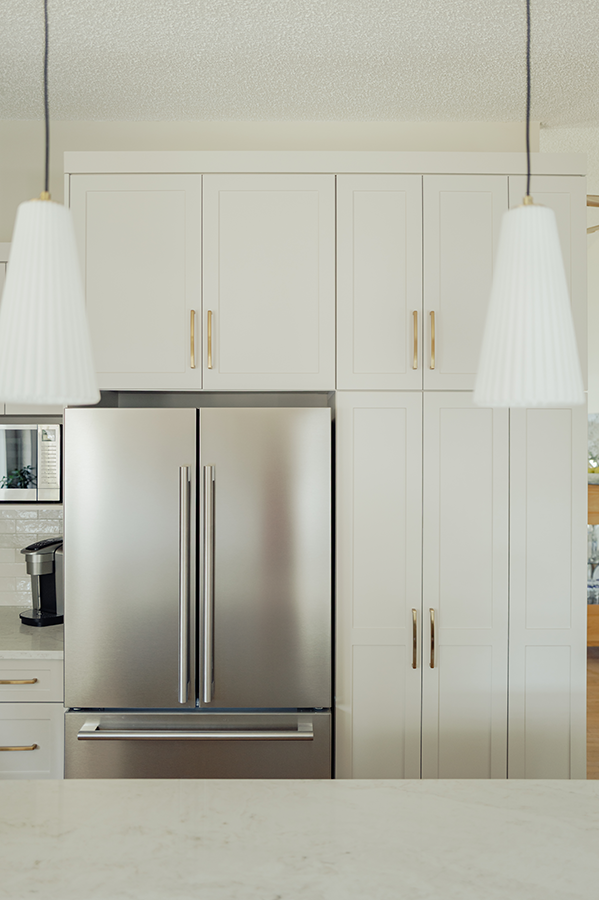
Pantry pull-outs, island drawers, tray dividers, a spice pull-out, a Super Susan, and a two-bin garbage pull-out were all built into the cabinet plan from the start. These are not afterthoughts. They are the reason the kitchen works every time a drawer opens or something needs to be put away. A kitchen that looks organized in photos but requires constant hunting in practice has not been planned. This one was.
The pantry tower addresses bulk storage without crowding the perimeter. The island drawers do more work than standard base cabinets at the same footprint. Every cabinet location was considered relative to how the kitchen is actually used.
Clean, Bright & Considered
The visible details carry their weight without competing with each other.
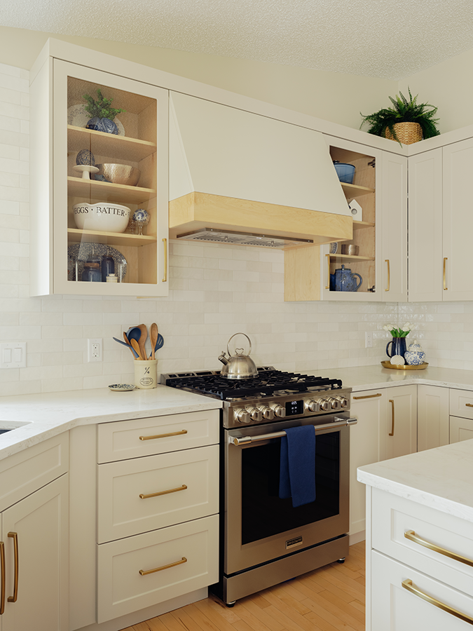
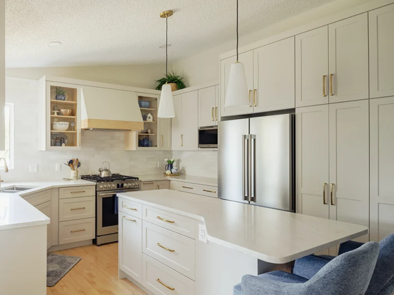
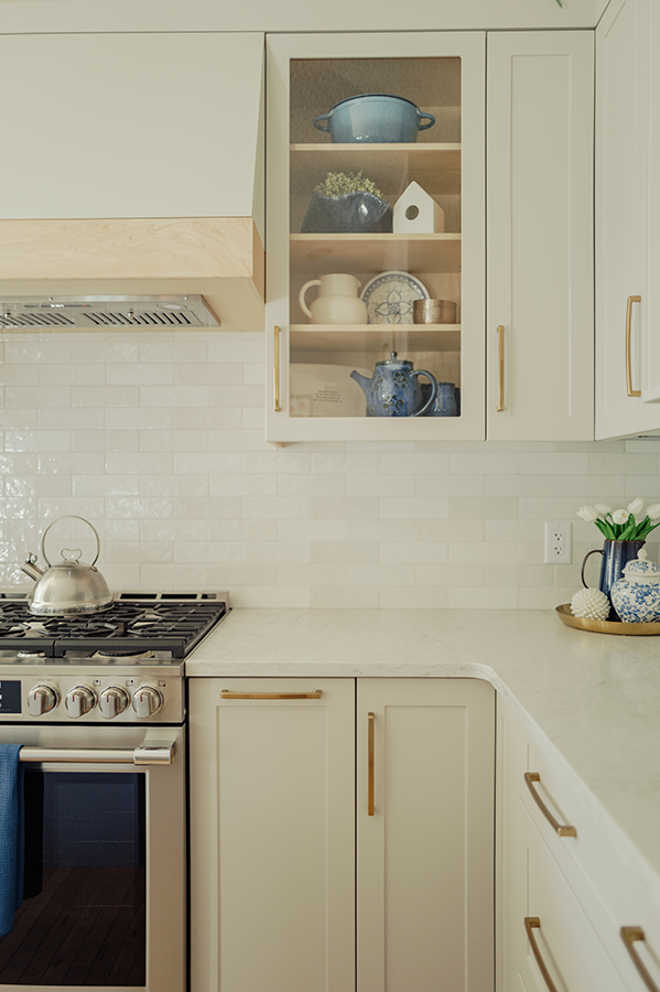
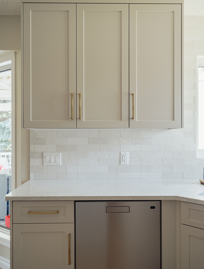
Quartz countertops with an eased edge profile keep the surfaces clean and practical. The white glossy tile backsplash runs tightly to the kitchen windows with clear anodized trim at the edge, a detail that is easy to get wrong and makes a clear difference when it is handled properly. Glass-front upper cabinets give the room a place for display without adding visual noise. The natural maple hood valance brings warmth into the upper portion of the kitchen without forcing it.
Updated lighting throughout: pendants over the island, recessed lights, and under-cabinet LED lighting that makes the countertops more usable after dark. Appliance locations for the fridge, dishwasher, microwave, bar fridge, sink, and range hood were all coordinated into the new layout rather than inherited from the old one. The hardwood flooring was repaired and tied into the existing floor. The walls were painted in a soft neutral tone with trim matched to the home.
A Kitchen That Was Considered
The kitchen is cleaner, more functional, and more considered than the one it replaced.
None of that came from adding square footage. It came from planning the island properly, building storage with intention, selecting finishes that work together, and treating the details as part of the design rather than afterthoughts to be sorted out later.
This project makes a straightforward case for what good kitchen design actually means. It is not the size of the room. It is not the price of the appliances. It is whether the layout fits the way the kitchen gets used, and whether the decisions behind the surfaces hold up as well as the surfaces themselves.
